Archive for Uncategorized

Monday, September 27th, 2010

Millions (and trillions) of cats

In the classic children’s book, Millions of Cats written by Wanda Gág in 1928, a lonely, elderly couple enter a delightful tale about caring and self-esteem that also lends itself to a discussion of number sense. Toward the beginning of the story, the woman tells her husband that she thinks a cat would make them happy. The comments set the husband off on a journey to find his love’s desired feline. His travels lead him to a hillside covered with hundreds, thousands, millions, billions, and trillions of cats! He tries to pick and, in a sense, does–them all!

Let’s look at the story from the perspective of series, the current topic in my Calculus class. For instance, the old man encountered c_1sum_{k=1}^{10^2} 1, c_2sum_{k=1}^{10^3} 1, c_3sum_{k=1}^{10^6} 1, c_4sum_{k=1}^{10^9} 1 and c_5sum_{k=1}^{10^{12}} 1 of cats, where c_1, c_2, c_3, c_4 and c_5 are some constants since he met more than 1 trillion cats! While a big number, a trillion is less than a drop in the ocean of infinity. In fact, even writing 1 and then zeros for the next two days produces a number that would be lost in an infinite landscape. This should help us begin to sense why concepts, such as sum_{i=0}^infty u_k, that involve the infinite can be nonintuitive and should be approached carefully. Let’s more clearly see this by gaining a better sense of the size of a trillion.

Uploaded from: http://www.dec.ny.gov/images/permits_ej_operations_images/niagarafalls.jpg

Returning to the story, the man travels home with the cats, indeed “trillions” of them. We’ll take the plural of trillion to equal 2 trillion. The massive caravan approaches a lake where each kitty takes a sip, leaving only a muddy mass in the place of the previous body of water. How much water did the group discover and consume? Suppose each cat’s sip is a teaspoon. Since 768 teaspoons make a gallon, 2cdot 10^{12} cats would sip 2 cdot 10^{12}/768 = 2.6 cdot 10^9 gallons. Can you visualize 2 billion gallons of water? To help, note that 550,000 gallons of water are estimated to roar over Niagara Falls per second. If the cats continuously took their teaspoon-sized sips, these picturesque falls would be left silent, with not a drop falling, for 2cdot 10^{12}/(768 cdot 550000 cdot 60 cdot 60) = 1.3 hours! Want to change the amount of water each cat might drink? Use WolframAlpha by clicking here. For instance, if each cat drank a cup of water, Niagara would be left without its roaring falls for just over 2 days! Such numbers give a sense as to the magnitude of a trillion. Still, it can be difficult to fully grasp a number of such size which further underscores how difficult it should be for our minds to carefully consider the infinite!

Later in the trip back to the cottage, the elderly man and his cats stop at a hill where each cat takes a mouthful. They leave a barren mound upon their departure. Let’s estimate the size of the hill? Searching the internet, it appears that a healthy lawn contains about 400 blades of grass per square inch. There are 4,014,489,600 square inches per square mile! So, if each cat took only one blade of grass, the hill would be 2 cdot 10^{12}/(400 cdot 4,014,489,600) which equals just over a square mile! But, the text states that each kitty consumes a mouthful. Suppose this correlates to each cat eating a square inch of grass! Then, the man walked up to a “hill” that was about 500 square miles in area! Check the computation or change the kittys’ consumption at WolframAlpha by clicking here.

This helps us see why the woman is so shocked to open the door to her husband and his entourage of millions, billions and trillions of cats. What happens next? What other mathematical questions can you ask? Read the book and ask (and answer) your own questions, further contemplate the size of a trillion and if you are studying infinite series, keep in mind that if a trillion can be tricky to consider then infinity can be even harder to grasp by our finite minds!

Thursday, September 16th, 2010

Steel this integral!

Are you ready for some Monday Night Calculus? With the NFL season having started only a few days ago, it is time to perform some gridiron mathematics! Our calculations will focus on the logo for the Pittsburgh Steelers seen below.

The outer edge of the emblem is a circle, which has the well-known ratio of its circumference to its diameter equalling π. Let’s now find the ratio of the perimeter of the red emblem to its diameter, defined to equal the distance from one point to the diametrically opposite point. This shape is often called an astroid or if you want to sound quite mathematical, a 4-cusped hypocycloid. The curve can be formed parametrically by graphing
x = frac{1}{4}(3cos(t) + cos(3t)) and y = frac{1}{4}(3sin(t) - sin(3t)) for t = 1 to t = 2π. This produces the curve:


which is the shape we’ll tackle with some Calculus computations! The diameter of this asteroid is 2 since two diametrically opposite points are (1,0), and (-1,0).

The upper left quarter of the asteroid is represented by the function
f(x) = left(1 - x^{2/3}right)^{3/2} for x from 0 to 1. We need only to find the length of this curve and multiply the result by 4. From Calculus, we know that the formula for the length of the curve y = f(x) from 0 to 1 is
L = int_0^1 sqrt{1 + [f'(x)]^2}dx. For f(x) = left(1 - x^{2/3}right)^{3/2}, f'(x) = -sqrt{1-x^{2/3}}/x^{1/3}. We seem to have a computational pile up when we consider finding L = int_0^1sqrt{1 + [f'(x)]^2}. We find an opening with a push of algebra and find a clear path to the equivalent expression
L = int_0^1 1/x^{1/3} dx. Need a replay of that computation? Try WolframAlpha by clicking here.

The curve of x^{-1/3} is plotted below

We are finding the area under a curve that increases without bound as x approaches 0 from the right. How improper! Indeed, this requires an improper integral! Getting down in the dirt of integration, we find
L = int_0^1 1/x^{1/3} dx = 3/2. You can do this by hand or pass the computation to WolframAlpha by clicking here. The length of a quarter of the astroid equals 3/2; so, the perimeter of the complete asteroid would be 6! We have our desired ratio of the perimeter to the diameter of the asteroid, which equals is 6/2 or 3. Things went from being quite irrational with the circle to rational with the asteroids. Nice exercising of our mathematical minds…now let’s go out and toss a ball around trying create perfect spirals, of course!


These ideas opened a lecture to my Calculus classes by my colleague Mike Mossinghoff who graciously filled in for me as I travelled. The students were treated to this example as a way to motivate improper integrals. Thanks, Mike!

Tuesday, August 31st, 2010

A Yoda Revolution

This semester, I’m teaching Calculus II. Yesterday, students submitted homework on finding volumes of solids of revolution. As a quick primer on these shapes, a solid of revolution is generated by rotating a planar region about an axis. For instance, rotating the right triangle below about the vertical axis generates the cone to the right.

For fun, we started class, having completed an entire homework set on solids of revolution, by creating a fanciful solid of revolution. Rather than using a planar region, suppose we take a 3D solid itself and rotate it. What will happen? Let’s try. In fact, let’s just do it. Do or do not….there is no try! If you recognize that quote, you may realize we are about to rotate a 3D image of Yoda as seen below.

Take a moment and imagine rotating this image of Yoda about the vertical axis. What will you get? Can you see it? It takes a couple of minutes with the math software I use in class but homework is returned as we watch the shape unfold. And here it is:

We then rotated it and several students commented that this angle of the Yoda solid looked like it should be attached to the wing of a commercial jet!

What’s the volume? In terms of the tools we had in class, we’d need to find a planar region that would produce such a shape and then describe that planar region as a function! If you are already scribbling away at such calculations, may the force be with you.

Tuesday, August 24th, 2010

Digit recognition with Pythagoras

Classifying handwritten digits is an issue, for instance, for the postal service. Automating the process of reading zip codes, for instance, can increase efficiency of mail sorting.

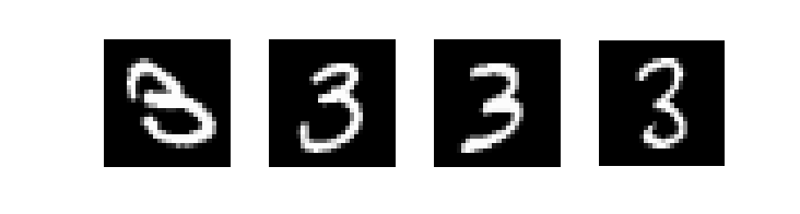
To explore this idea, we will use the MNIST database of handwritten digits, which contains a training set of 60,000 digits and a test set of 10,000 numbers. Each digit in the database was placed in a 28 x 28 grayscale image such that the center of mass of its pixels is at the center of the picture. For instance, below we see four different examples of the number 3 from the dataset. Can we create an algorithm to automatically recognize that each of these is the digit 3?

There are a variety of interesting and even complex algorithms for digit recognition. Let’s develop a simple method that uses only finding the average of an array of numbers and the Pythagorean theorem.

A mean digit

Let’s call a digit we want to classify a test digit. We’ll store each digit as a vector where each entry in the vector is the grayscale value of one of the pixels in the corresponding 28 x 28 image. So, the information for this test digit is stored in a 784 x 1 vector that will be called the test vector. While we could test this test vector against each training vector and see which is closest to it, let’s try something a bit different.

There are 5,923 images of the number 0 in the training set. Rather than compare our test digit to each of these images, we will create an average handwritten 0 from this training set. Let the ijth pixel of this average zero equal the average of the ijth pixel in all the images of a zero in the training set. Let m^0 denote average 0, which is a 784 x 1 vector. Let’s also denote t^{0,i} as the ith training digit for the number 0. So, mathematically, we calculate the ith element of m^0 as:

m^0_i = sum_{j=1}^{5923} t^{0,j}_i

The notation could make this look trickier than it is. Keep in mind this is only averaging the pixels, for instance, in the upper left hand corner of all the images of our training digits for the number 0 to find the pixel value in the upper left hand corner of our “average 0” image.

Our algorithm is then simple. Suppose we find the norm between the vectors for the test digit and each average digit computed above. Whichever average digit produces the smallest norm with the test digit indicates how we will classify the test digit. For instance, if the smallest norm comes from the vectors for the average 4 and the test digit, then we classify the test digit as a 4.

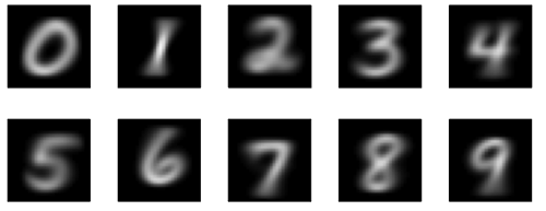
How do we do? What do the digits look like? If we compute an average digit for all the numbers from 0 to 9, we get the images below:

Let’s concentrate again on the number 3. This method recognizes that all threes below (which are the same four seen above) are indeed the number 3.

But, those complicated algorithms for digit recognition exist as it can be difficult to fully recognize handwritten digits. Sometimes, we write fast and some of us, frankly, have hard to read handwriting! The digit we see below is a 3 but is classified as a 5. See why? Not too hard to see the elements of the digit 5 that are within it.

Nonetheless, this is a simple and accessible way of classifying digits thanks to Pythagoras and a 784 dimensional version of his theorem!

Tuesday, August 17th, 2010

Flipped out accuracy

Mathematics and Sports book coverInterested in math and baseball? golf? football? soccer? basketball? Check out the newly released Mathematics and Sports book edited by Joe Gallian! My work on math and soccer, which includes a contributed article in that book, led me to help with the ESPN show, Sports Science, during the 2010 World Cup.

This post is about their call to help with math related to a bicycle kick. The producer from Sports Science had already called regarding the trajectory of a soccer ball. Suddenly, another email came requesting help with mathematics. The piece was on the accuracy of a bicycle kick. My family was on vacation so any time I devoted to work was limited if not even existent. Knowing their short timelines, I was willing to listen to what was needed and see if I could help quickly. The producer was convinced it wouldn’t be very hard for me. So, on that Friday morning, I set my daughter up for “screen time,” which would consist of a 30 minute children’s show. This was my “stopwatch” as to the amount of time I had to “solve” whatever problem was soon to come my way.

I called the producer and she presented their problem. They were looking at the accuracy of a bicycle kick. In particular, how accurate does a kick need to be? I shared some assumptions I could make on the problem and she agreed they were acceptable. I stood in the bedroom looking for a piece of paper. I found a tissue. A felt tip pen worked to jot down my idea as to a solution. Indeed, I had sufficient work to indicate I could solve the problem. I responded, “I need to sit and look at my work carefully but I think I can give you your desired formula.” She responded, “GREAT! That will allow our video analysts to determine the speed of the ball from the video we will be using in the piece.” I responded, “I have about 23 minutes to work on this and then we are off for the day, enjoying New York City. If you don’t hear from me in 30 minutes, you won’t hear from me until tomorrow.” She replied, “Then, I need to let you go.”

I moved from the bedroom to the living room to find my daughter enjoying the show. I sat down and reviewed my tissue paper notes. I found paper and worked on it again. I thought about how my assumptions impacted the feasibility of the result and all seemed fine. I then worked out the mathematics that gave the formula the group needed for their piece, although it was the result of the formula they really needed. I had about 15 minutes left. I thought, “Ok, I have what they need. But, I want to be sure they understand it and not simply plug and chug. How do I do that?” I sat dumbfounded for a moment and then realized, “How would I explain it to students? Through pictures, formulas and text.” So, I used PowerPoint as my blackboard and wrote everything up. Then with a few minutes (only) to spare, I had the slide show, converted to it a PDF, and emailed it to ESPN. Was the explanation necessary? I wasn’t sure. But then, about 24 hours later, the producer emailed as she understood my work and asked about a component of it which enabled us to correct a mistake I’d made in my calculations. (I used the Google calculator as I didn’t have one with me. I had made a keystroke error that I didn’t notice even though I had “checked’ my answer.”) How wonderful to have the producer understand to the point of making corrections!

In the end, the piece appeared on TV. When? As we were driving back from vacation! I learned on Twitter…10 minutes before it appeared on TV…when we were standing in line to be seated for lunch! Neat to know it was on TV and funny to have no way to view it, record it, or connect with someone to have it recorded. But now, you can view the online version, as I did a few days later:

Did you recognize the part I helped with? Very cool work by Sports Science and a pleasure to be a help…with my 30 minutes of open time. We had a great day, by the way…doing all that is fun and in totally vacation (non-math) mode!

Thursday, July 29th, 2010

Adding heat to a hot movie

While I have yet to see the movie, I’ve been the recipient of considerable buzz about the movie Inception. Given this is one of the hot summer movies and simply how amazingly hot it has been this summer, it seems fitting to compose a post on the heat equation!

The heat equation is a partial differential equation. For fun, I’m going to apply the equation to a grayscale image of the Inception movie poster. We see the poster below.

The grayscale value of each pixel represents the heat of that point on our rectangular plate. It just so happens that the heat is distributed in the exact image of the movie poster! Keep in mind that dark colors are cooler temperatures. To see how the heat is distributing across the plate we will create a contour map. On a topographical map if you travel along a line you stay at a constant altitude in the 3D landscape. In this contour graph, if you move along a line you stay at a constant temperature.

The heat distribution is possibly more easily seen when we add color to our contour map with red being hot, blue being cooler and white being a temperature of 0.

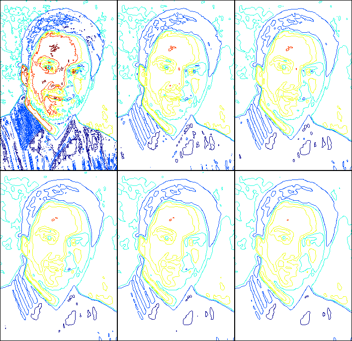
We haven’t apply the heat equation! Let’s do that now. We will apply the heat equation for a small interval of time and see how the heat distributes in the poster! Keep in mind this is done on a computer using numerical algorithms. What happens? Just look below.

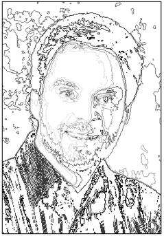
Not a fan of inception? Try it yourself or for that matter on yourself. In fact, I started by heating up my own face which is also easily done by simply walking outside! Below you see the grayscale contour map and the animation.

Cool, eh? Or should it be, hot stuff, eh?

Wednesday, July 28th, 2010

Getting graphic

Today, a new header image (the old was simply the default image) appeared on this blog. It seems appropriate to explain the images as the collage is meant to represent the various ways I move mathematically. Let’s start at the left and move our way to the right.


Almost hidden in the lower left and upper right of the image is an image representing the World Wide Web. The original image is quite striking and comes from David Gleich. This image represents my research in web ranking.


The directed network comes from recent research on Twitter that includes both ranking and clustering. Here we see the status of 9 celebrity Twitter accounts in mid-July 2010. An array from celeb A to celeb B indicates that A follows B on Twitter.


The image in the center of the graphic combines teaching, performing and research. The graphic on the T-shirt is an image (believe it or not) of Marilyn Monroe. Her image is transformed using a function in polar coordinates! The mask on my face comes from the Mime-matics show. The piece is on applications of math where this character is dancing to music on an iPod. Math plays important roles in digital media. Finally, a basketball balances on my finger. My research in sports ranking has included the creation of mathematically-generated brackets for March Madness. This once research project now is also part of a unit I teach in modeling.


This image comes also from the Mime-matics presentation. The piece uses polygonal shapes to create various images from happy to angry. This image stems from the character trying too many pieces at one time!


The mathematical equations and this image come from my research in iterative methods and multigrid. This graph is the algebraic error of a linear system.


That’s it! Blog entries will, in time, make such connections stronger…but this unveils the symbolism of this image and some of the ways I explore mathematics.

Wednesday, July 21st, 2010

Euler, Yoda, and Wildcats, oh my!

In the last post Doodling with Euler, we explored the Euler Characteristic with a sweeping doodle! Now, let’s apply it to some other images!

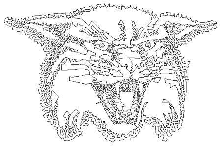
First, consider this image of the Davidson College Wildcat logo.

The image is constructed first as a stippling of the standard logo. Then, an algorithm is run that forms a Traveling Salesman path over the vertices. So, we have one continuous line that forms a circuit over these points. A distance measure was also used so there are no intersecting lines in the image. So if we count vertices in the original image, there are 5,000. In the previous post, we included intersection points as vertices. Again, there are none in this image. How many edges? There is one edge for every vertex so there are 5,000 edges, too. So, how many faces are there in this image? What do you think?

Let’s lean on Euler for help. Remember

V – E + F = 2.

So, for the Wildcat image, we have:

5000 – 5000 + F = 2,

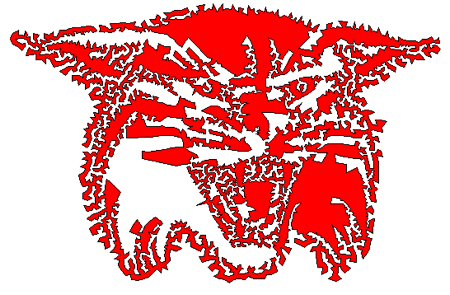
so, F = 2. Think about that. This means there are only 2 enclosed regions in this image! Believe it? Look below, and you can see it easier as we’ve enclosed one region in red and left the other its original white.

Let’s try another image. Now, let’s use for the force on an image of Yoda! This close-up of Yoda’s face is part of a model created by Kecskemeti B. Zoltan.

The larger image, which can be accessed from Using the Force of Math in Star Wars, contains 53,770 faces and 53,756 vertices. So, how many edges are there? Again, we simply apply Euler’s Characteristic to find:

E = V + F – 2 = 53770 + 53756 – 2 = 107,524.

Yoda’s feeling pretty on edge in this picture!

Hope you enjoyed using a powerful, among many, insight of Euler!

Tuesday, July 20th, 2010

Doodling with Euler

Let’s learn some math by doodling.  Let’s specifically learn the Euler Characteristic, which given it is attributed to Euler should lead to big expectations as to its power!  Why?  Let’s review a bit of mathematical history.

Leonard Euler

Euler was a famous mathematician who lived during the 1700’s.  He wrote hundreds and hundreds of pages on his mathematical discoveries!

Among Euler’s many works, he introduced the concept of a function and was the first to write f(x) to denote the function f applied to the argument x.  He also introduced the modern notation for e which is the base of the natural logarithm and the letter i to denote the imaginary unit.  The use of the Greek letter p to denote the ratio of a circle’s circumference to its diameter was also popularized by Euler, although it did not originate with him.

Euler’s powers of memory and concentration were legendary.  He easily dealt with interruptions or distractions, often working with his young children playing at his feet.  This became important later in life when he was blind.  There is a story of two of Euler’s students independently summing seventeen terms of a complicated series.  They disagreed on the 15th decimal place; Euler settled the dispute by recomputing the sum in his head!

Euler is often considered one of the greatest mathematicians and his discoveries are part of a lot of math today.

To noodle a doodle

Time to doodle! To begin, place a pencil on a piece of paper and maybe even close you eyes! Create your doodle be drawing in big sweeping motions, keeping the pencil on the paper at all times. Remember that the longer you doodle the harder the exercise. Here’s my doodle:

Now, place dots at every crossing point in your doodle. Also place a dot at both endpoints in your drawing, unless somehow you started and ended at the same spot. Count each dot, or vertex, and write that number on your doodle. Here are the 11 vertices for my doodle.

Now, we want to count the enclosed areas of the doodle. These are also called faces. Write this number on your paper. Here are the 9 faces I found in my doodle.

Notice that the enclosed area or face that is the entire outside area of the piece of paper is counted as a face. This will be important in a moment.

Finally, we count each segment between two vertices. These are called edges. Write this number on your paper. As you see below, my doodle has 19 edges.

Now, add the number of vertices and faces and subtract the number of faces. Here is my example with vertices, edges and faces all counted within the same figure.

Now, let me use my power of mathematical prediction! You got 2! In fact, if you didn’t, try counting your vertices, faces and edges again and check your addition and subtraction.

How did I know? If we call the number of vertices V, the number of edges E and the number of faces F, then the Euler Characteristic states that

V + F – E = 2.

Now, Euler didn’t simply show this to be true for every doodle he could draw. He proved that it would be true for ANY doodle. By proving it mathematically, he proved it would work for infinitely many doodles by writing one proof!

Try the activity again with a new doodle and see if you get the same answer. Again, V + F – E will always equal 2, for any doodle you draw!

Finally, as a teaser, we can extend Euler’s result to the dodecahedron we see below. Count the number of faces, edges and vertices on the shape and you’ll find that Euler’s Characteristic holds. Does it always? What do you think? Why?


Thanks to Austin Totty, a Davidson College math major, who helped develop this exercise, although slightly adapted for this blog. The exercise was used with middle schoolers at a Math Day at the University of North Carolina at Charlotte. The idea of doodling comes from teaching from The Heart of Mathematics by Edward Burger and Michael Starbird. Enjoy.

Wednesday, July 14th, 2010

Jabulani math

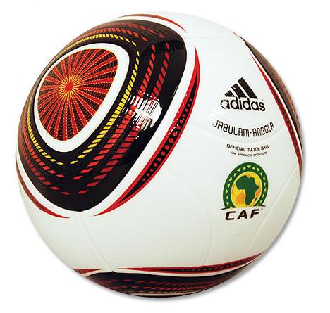
Given the last blog entry detailed my input on the Sports Science piece on home runs, it seems only appropriate to give the details of how my connections with Sports Science started.  The week before the World Cup began, I was in NYC with my family. The trip combined work and fun activities in the city.  Suddenly, the media’s emails began.  Each email inquired about the mathematics of predicting the trajectory of soccer balls.  Why? The new Jabulani ball, designed by adidas for the 2010 World Cup, was the target of some players’ complaints about the ball’s unpredictability. This is the same ball that was touted as being the closest to being perfectly spherical to within one hundredth of an inch — that’s pretty round! The ball was also very smooth — so much so that grooves were added by the designers. With all this, how could such a ball be seen as more unpredictable than others? Such a question led to the emails sitting in my Inbox.

It was fun to field the calls. The reporters knew information that I didn’t. I got to think about the trajectory of soccer balls, which was a topic about which I wrote several expository articles including an article for the Mathematical Association of America’s Math Awareness Month.

Part of the humor of my help on this was related to where I was at the time. The show works on a short timeline to keep topics relevant. So, we agreed I would call on that day but I would call rather than receiving a call. My family was at Coney Island in New York. There was a bit of time where sandcastles were under construction and my wife turned to me and said, “Now. This is a good time to make the call. Enjoy. We’ll enjoy hearing how it went.” So, I walked up to the boardwalk and found a quiet spot. And there, I talked math, physics and soccer balls. I shared as much as I could…connecting the need for roughness to golf balls, discussing how hard it is to model such things, and mentioning different types of flow and their impact on a ball.

In the end, it appears that some of my comments were helpful. The producer often said, “This is very helpful. Just keep going.” I was pleased when the show aired to see some of the concepts make their way into the video–in very cool Sports Science fashion.

For students and professors of math who are reading, you can learn more details of modeling the path of a soccer ball using math with my Math Awareness Month article, Bending a Soccer Ball with Math. This would be material suitable for a math class and could motivate discussions on modeling trajectory and how difficult it can be to include assumptions of air resistance and the shape of the object.

How did this materialize into a Sports Science video? Check it out…